From fragmented identity to independent by design.
Vanova Health.
Vanova Health helps independent physician practices strengthen their businesses without giving up the independence they've spent years building.
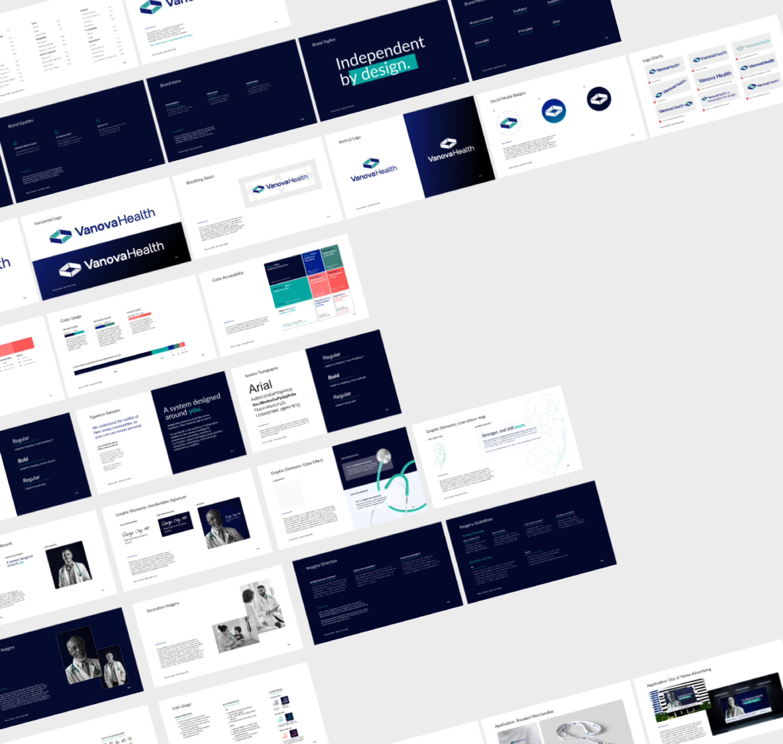
Working alongside Creative Director Francesca Farrisi, I helped transform a fragmented visual identity into a cohesive brand system—redesigning the visual language, developing the brand guidelines, art directing photography and helping bring the new positioning to life across web, print, digital and environmental applications.
Visual identity · Brand system · Art direction · Photography direction · Website · Digital · Print
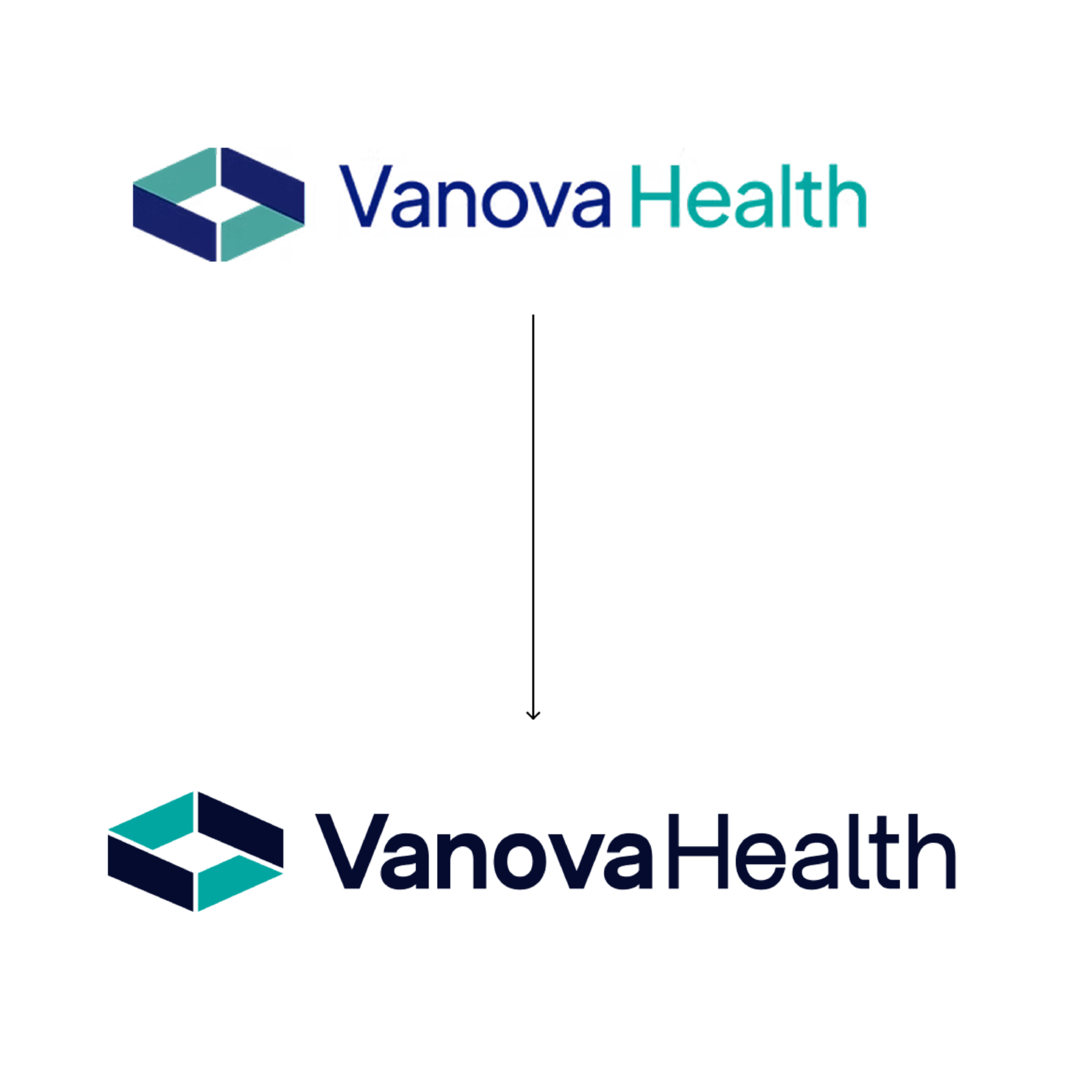
Create one brand from many pieces.
Vanova had a strong offering, but its marketing had accumulated rather than evolved as a system. Web, print, solutions, programs and event materials felt disconnected, while generic healthcare imagery and category language made it difficult for the brand to communicate what made it different.
The opportunity was bigger than a visual refresh: build a brand capable of expressing Vanova's belief that independent physicians shouldn't have to choose between growing stronger and giving up control.
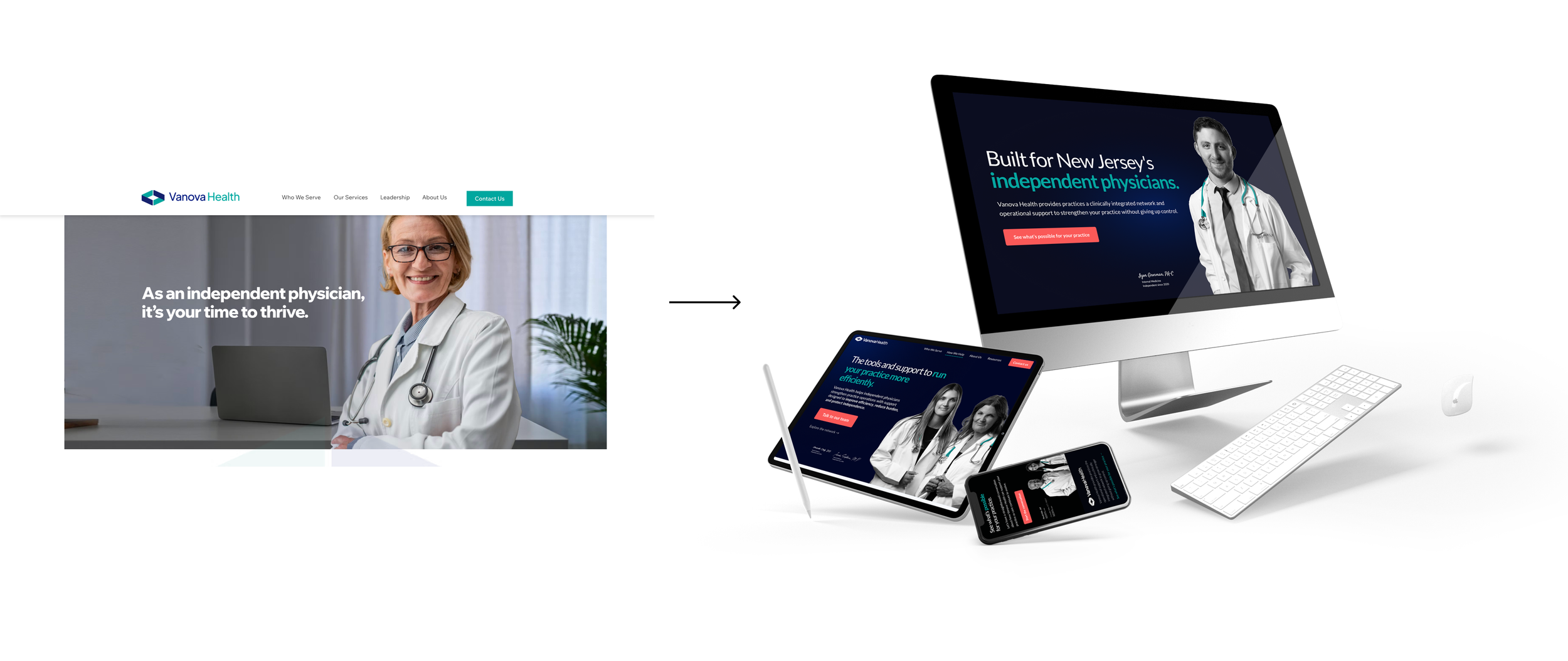
Design around independence.
The category was selling scale. But for physicians who had spent careers building independent practices, scale could sound less like opportunity and more like losing control.
The new positioning shifted the conversation:
FROM
Grow your practice.
TO
Strengthen your practice without giving up control.
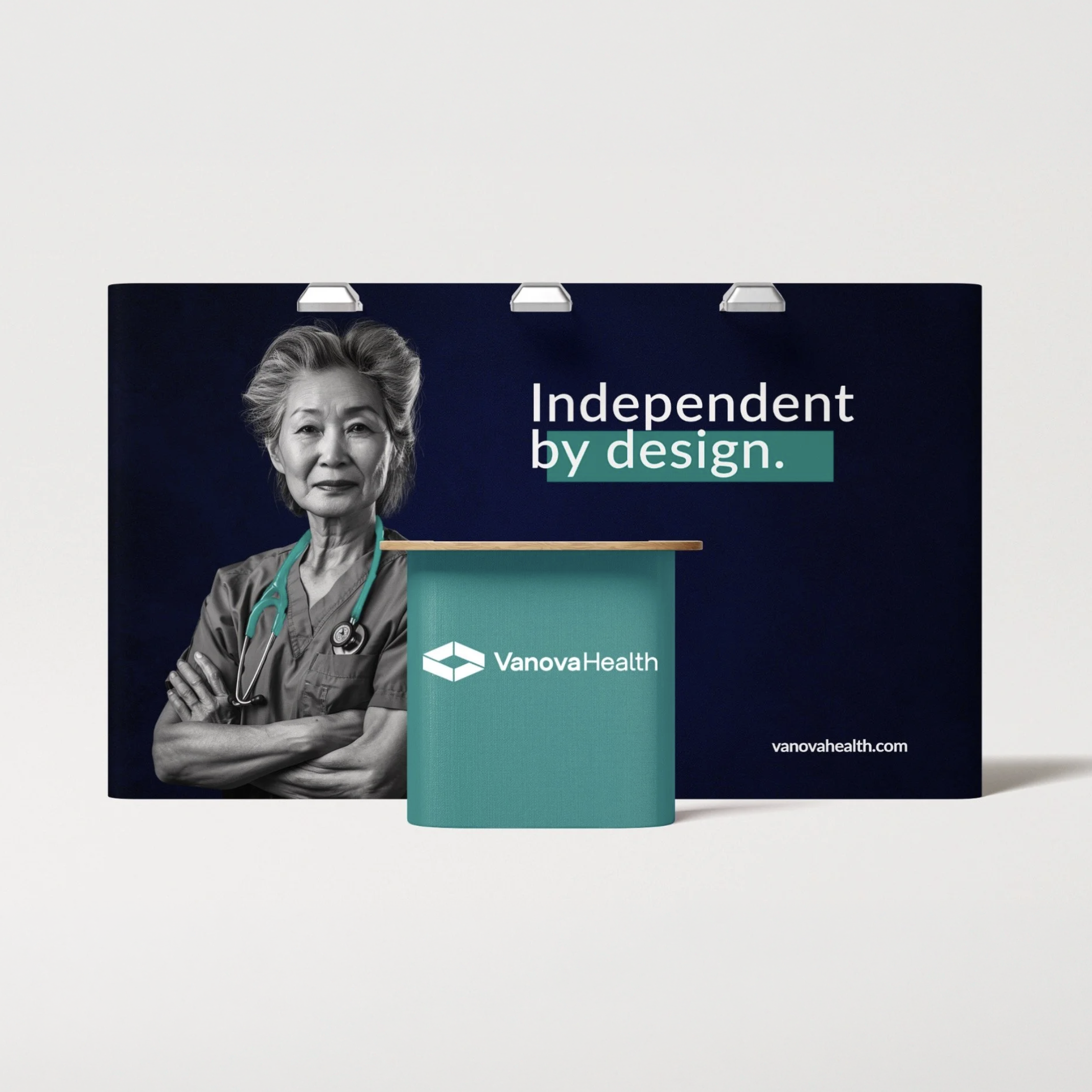
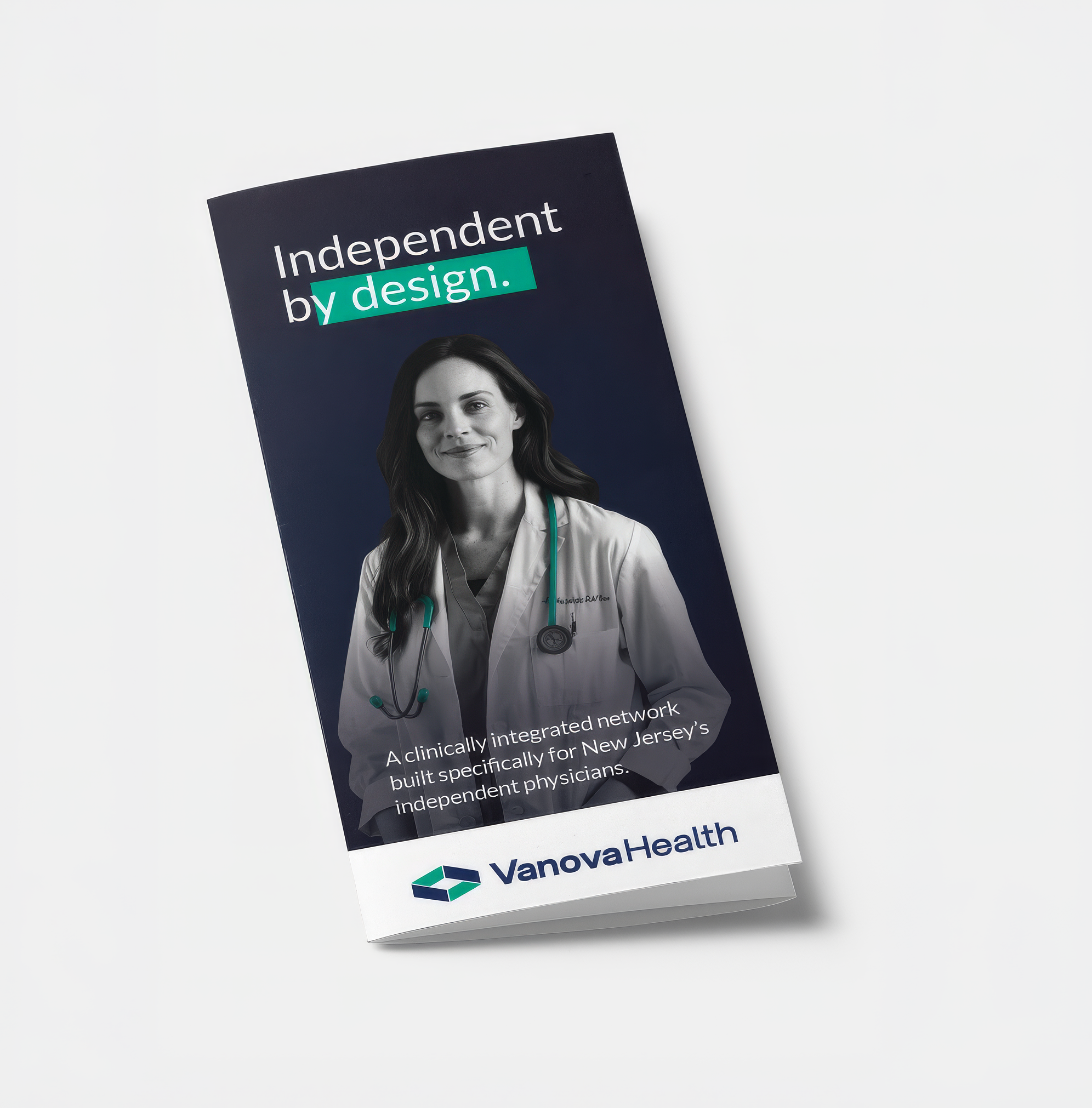
That thinking became Independent by Design—a platform built around independence as an intentional choice, not something physicians have to surrender as they grow.

Build quiet authority.
Vanova needed to feel established enough to earn physicians' trust without looking like another healthcare corporation trying to absorb their practice.
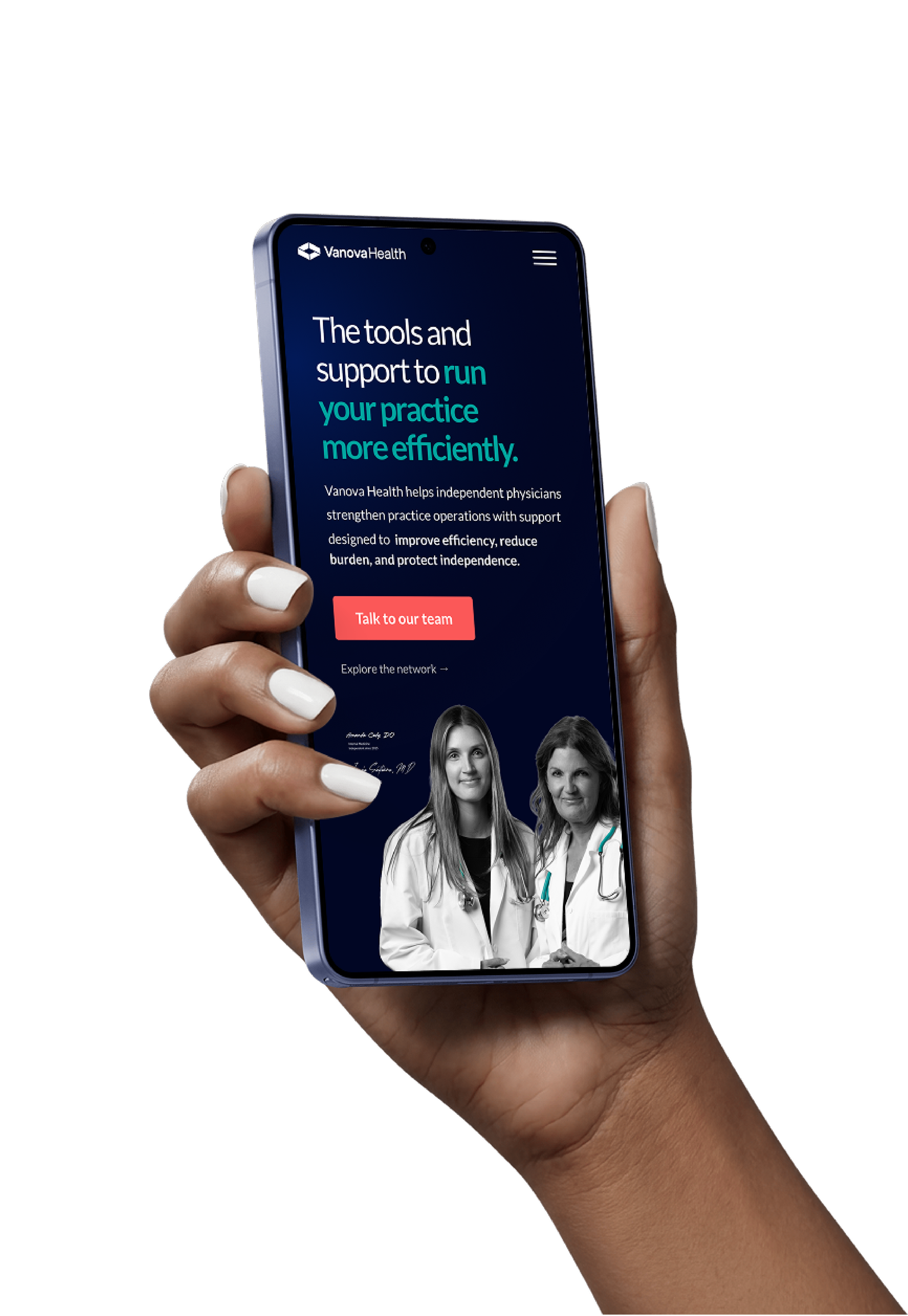
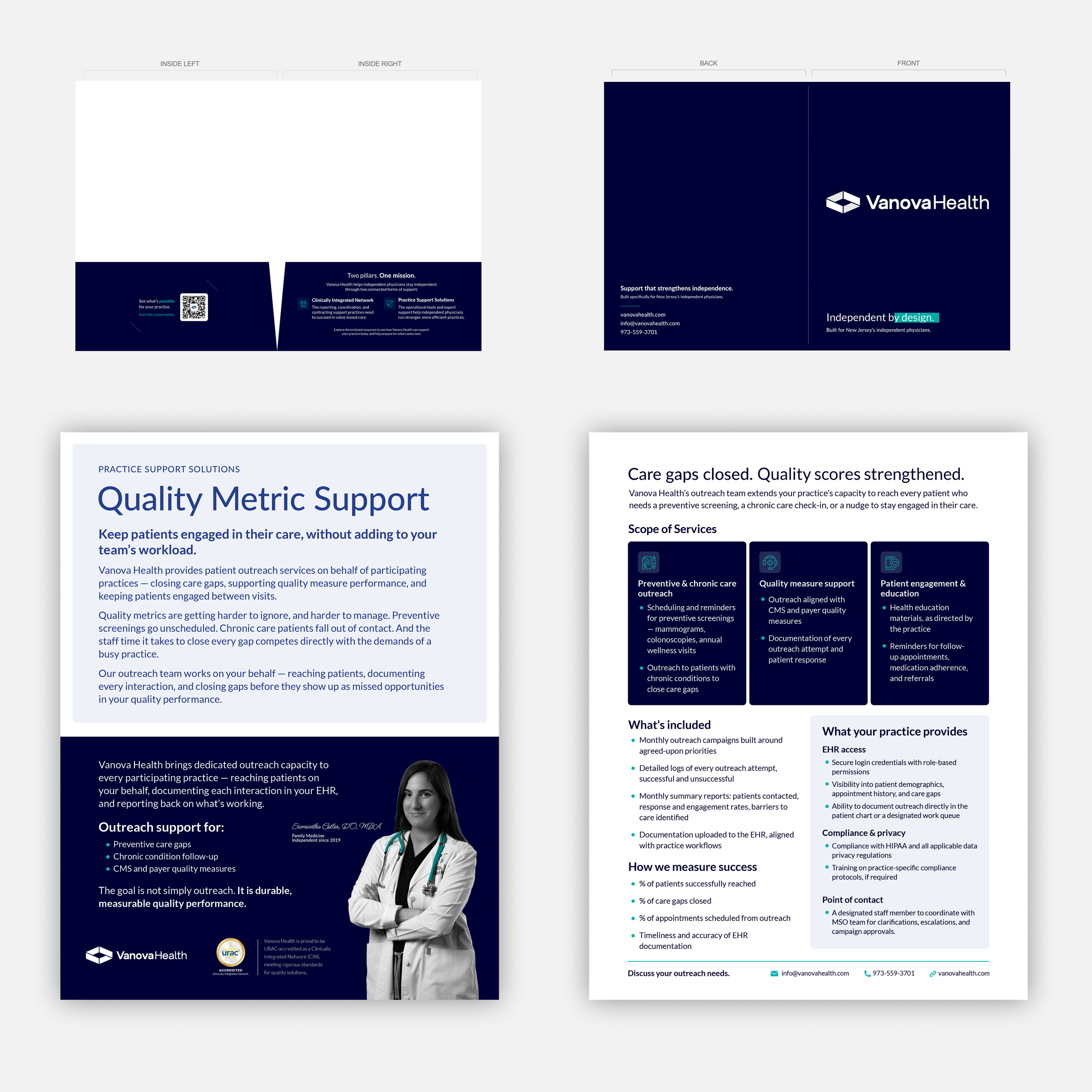
I helped develop a visual system built around restraint: sophisticated typography, a focused color palette, editorial layouts and a distinctive approach to photography.
Vanova's teal became an intentional signature, creating a brand that felt credible and premium while still unmistakably human.
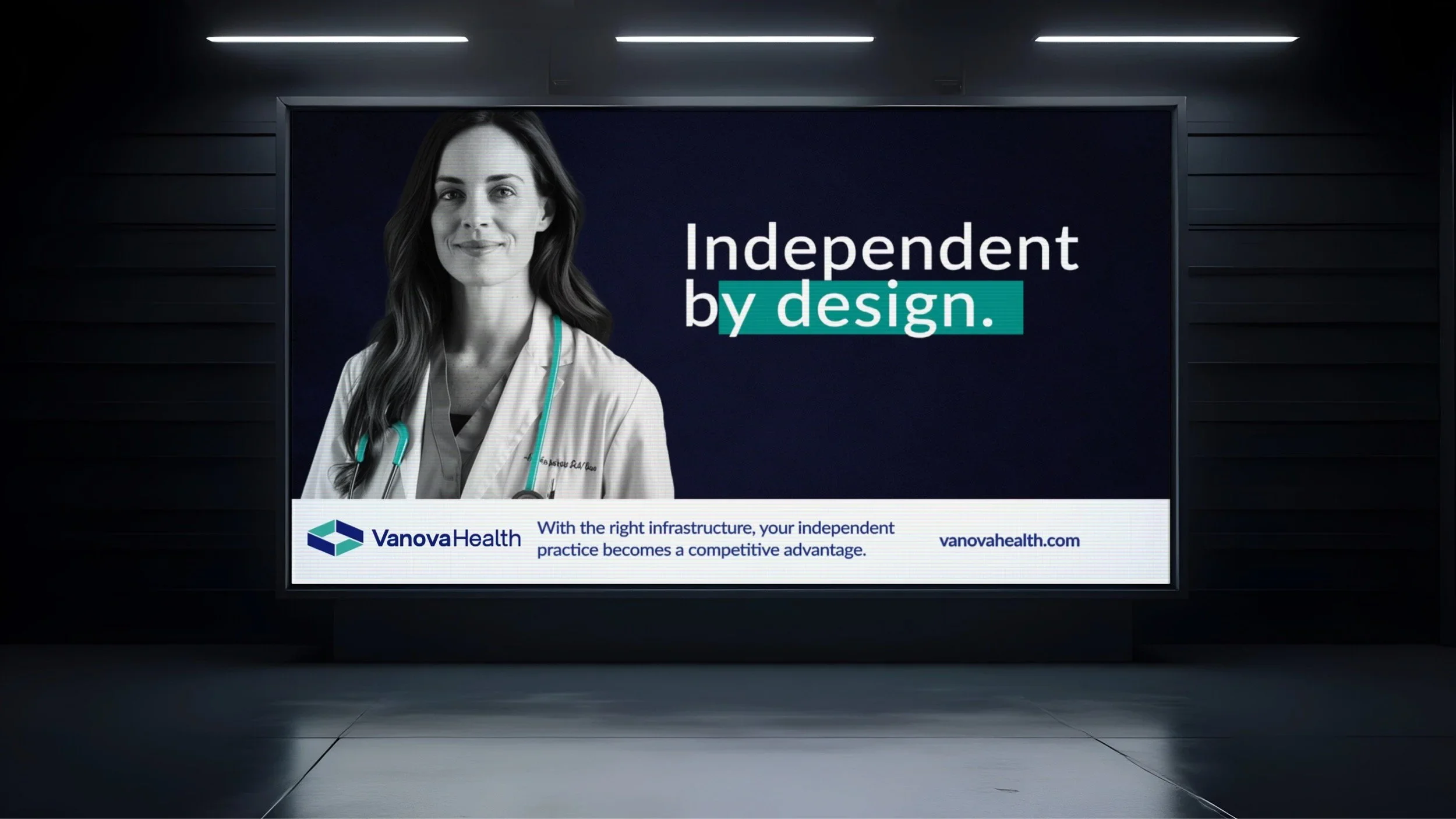
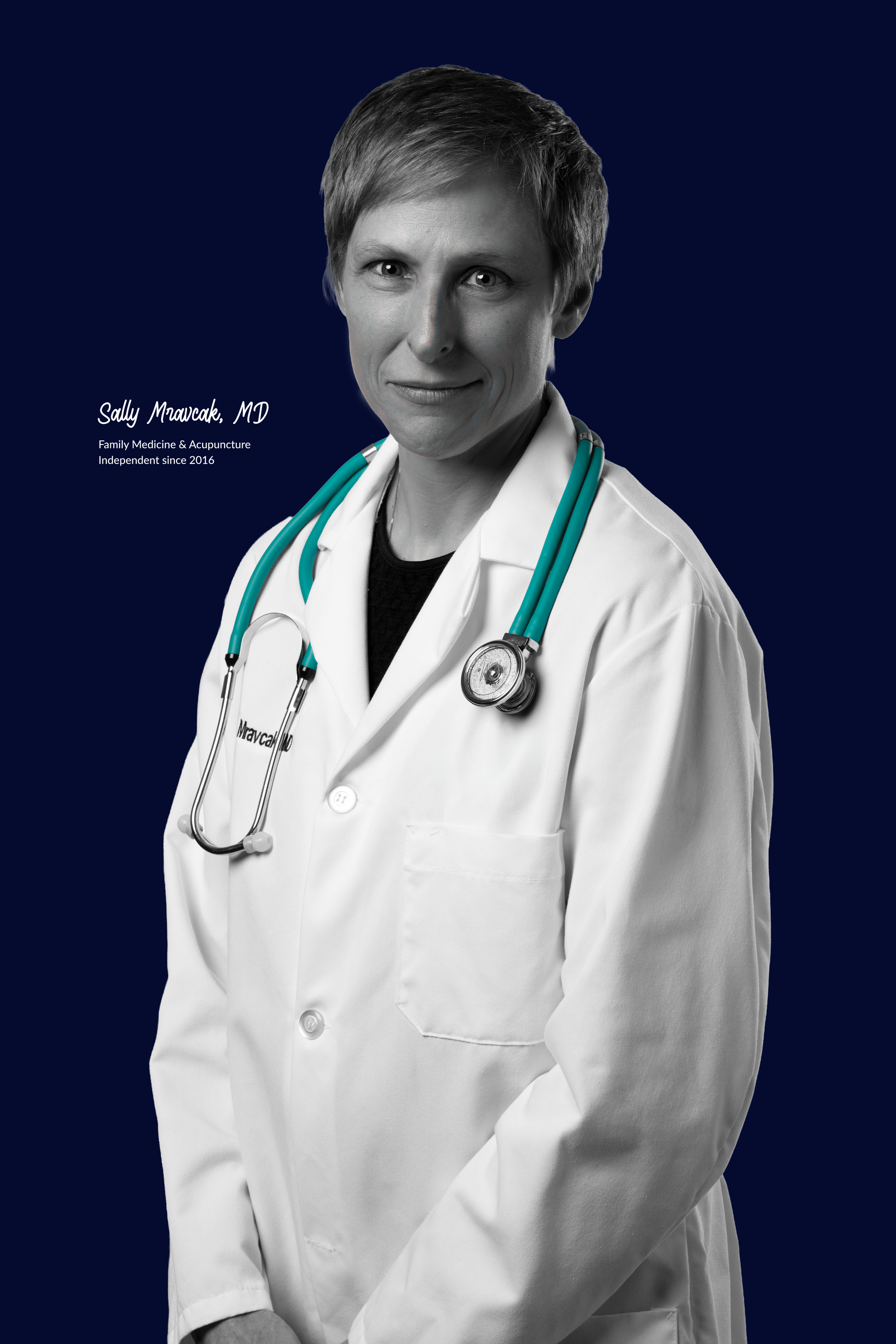
Generic healthcare stock photography simply wasn’t going to cut it.
So we put the physicians themselves at the center.
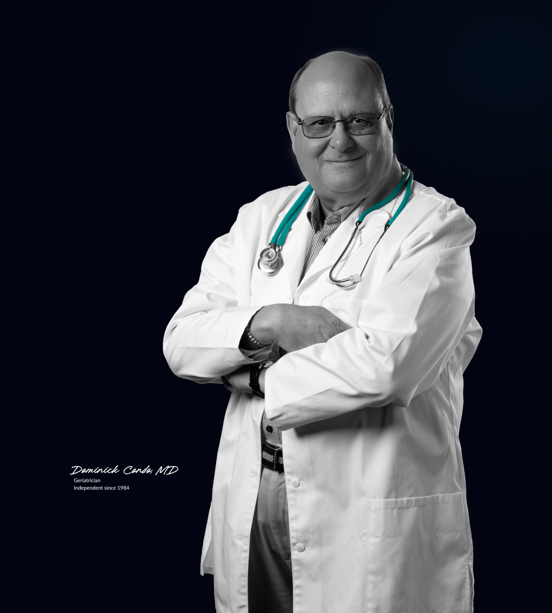
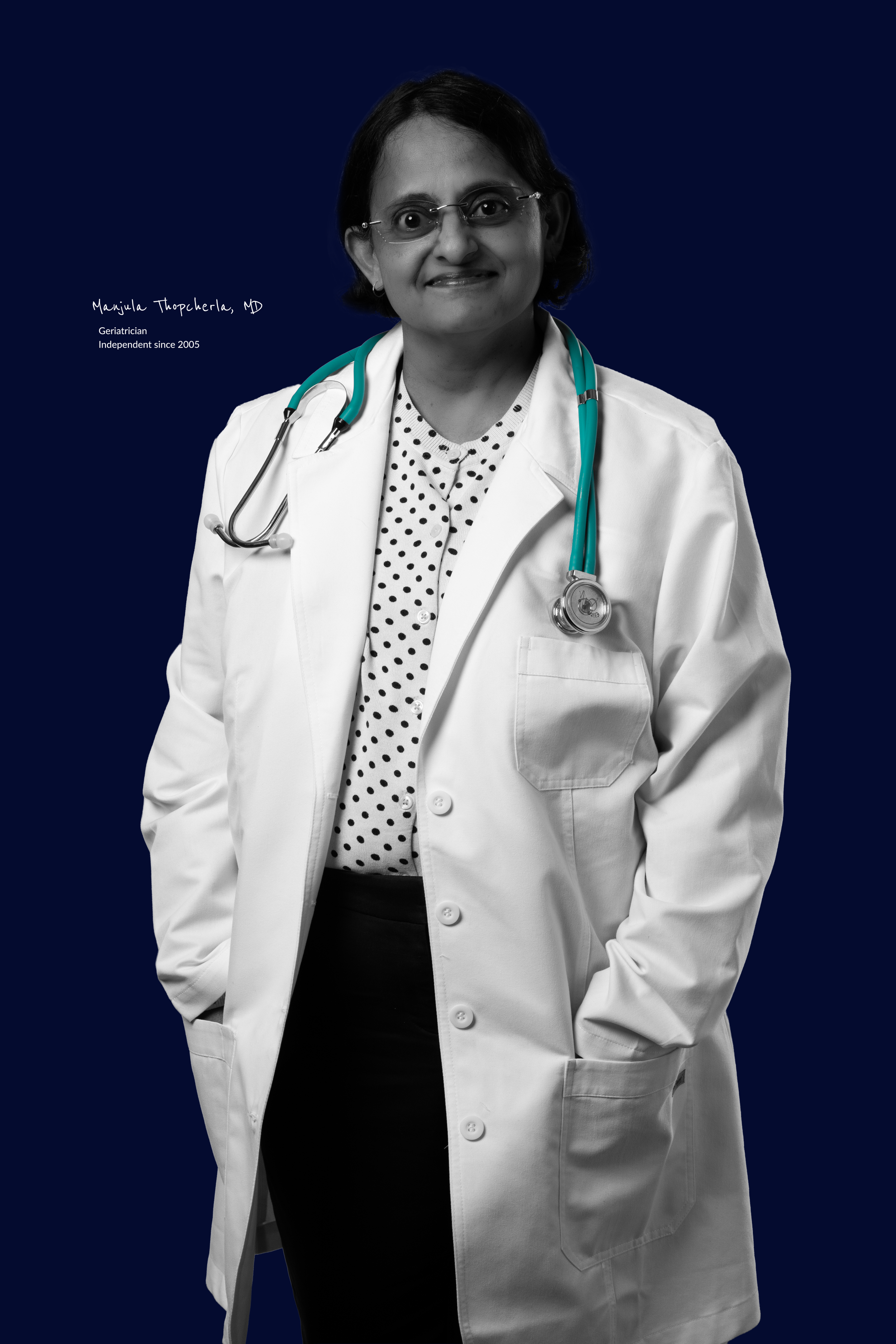
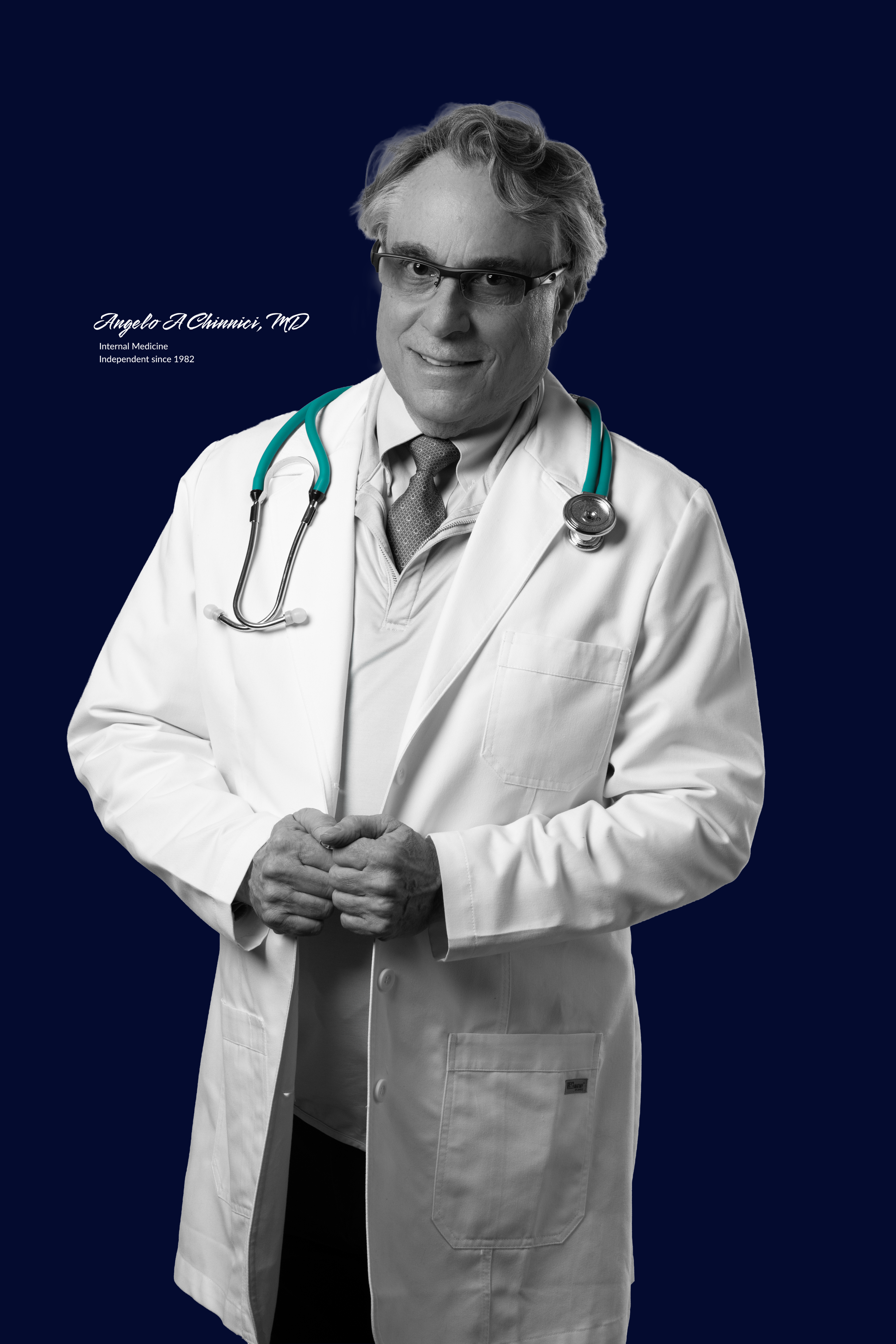
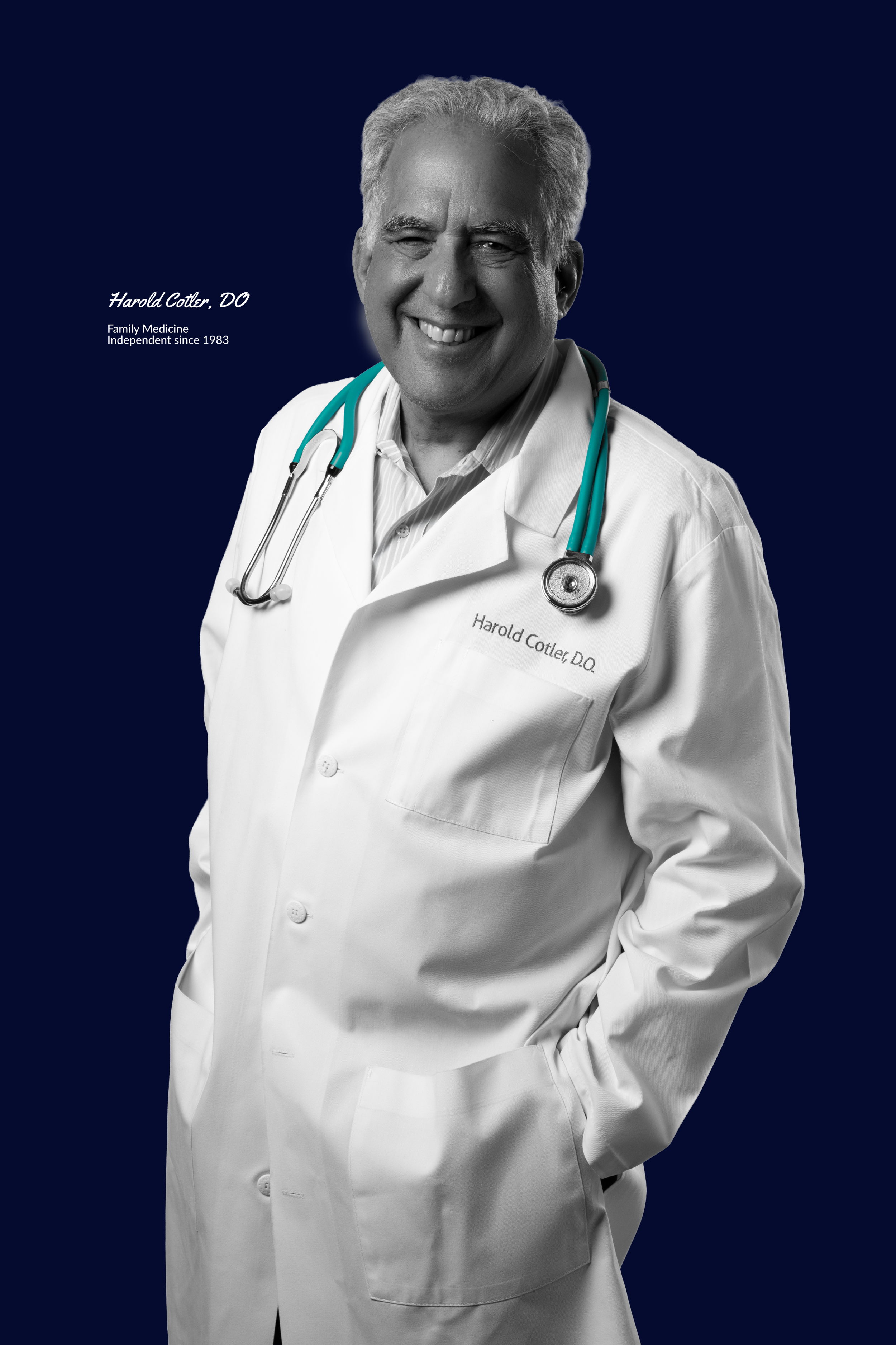
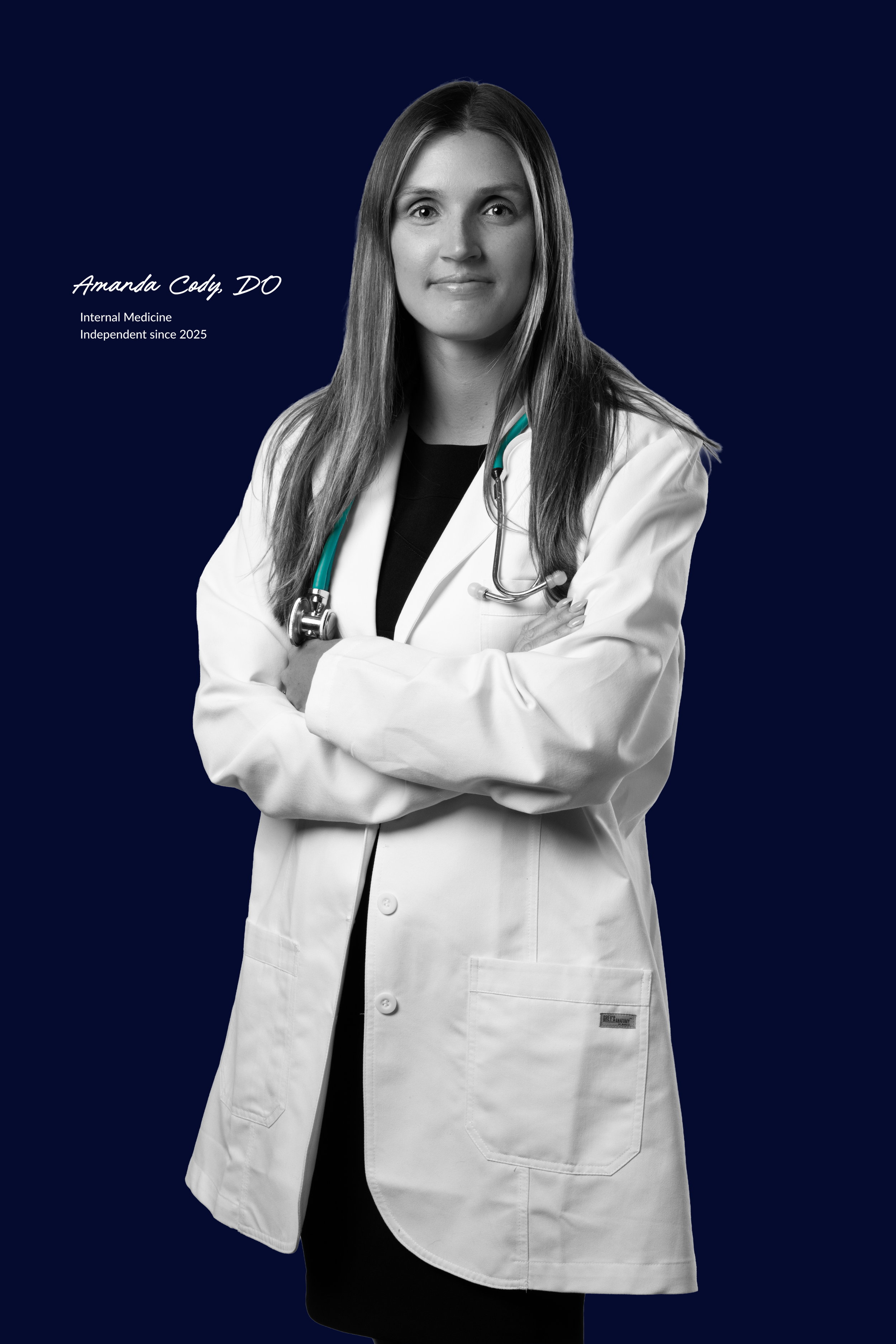
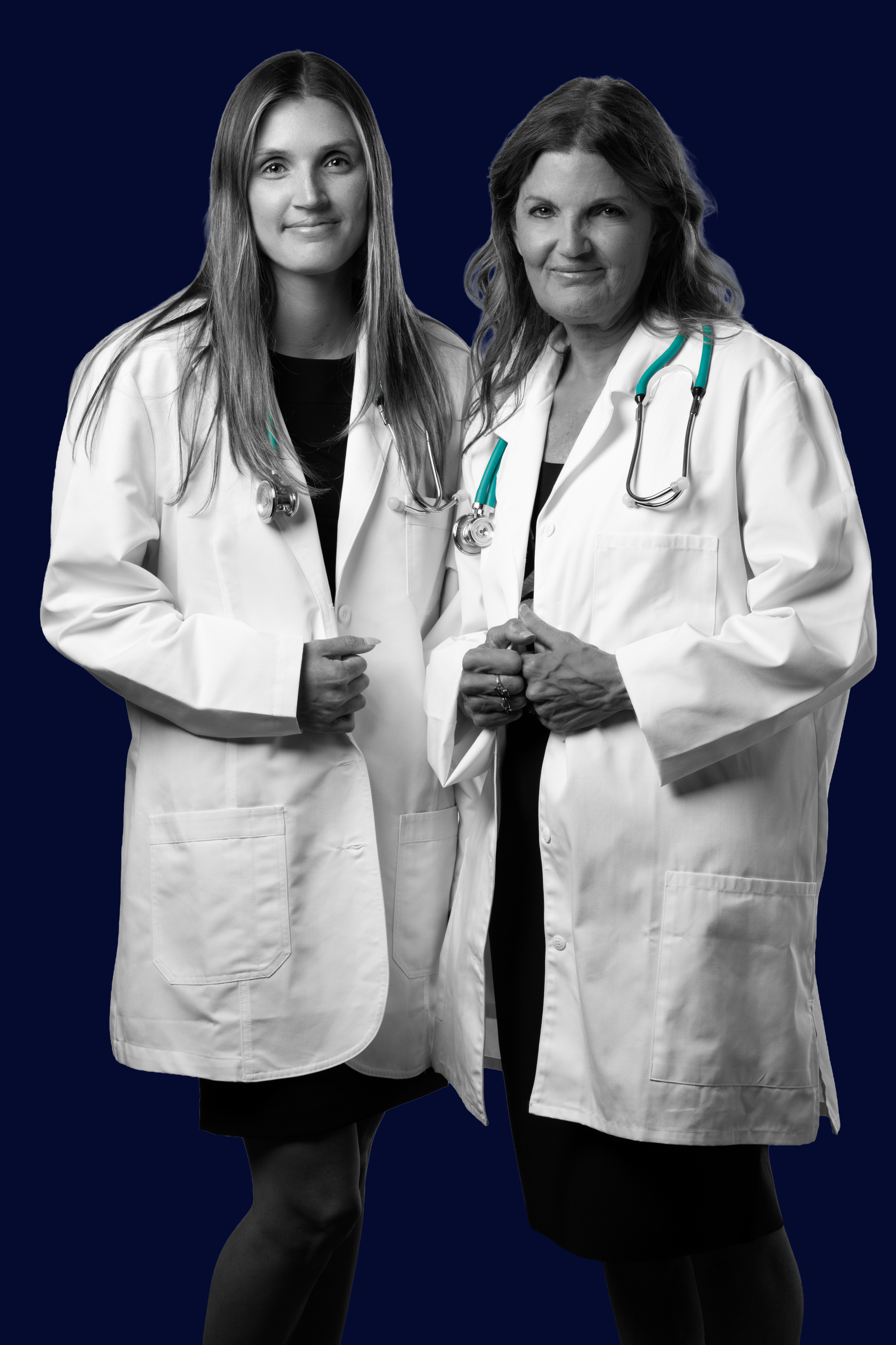
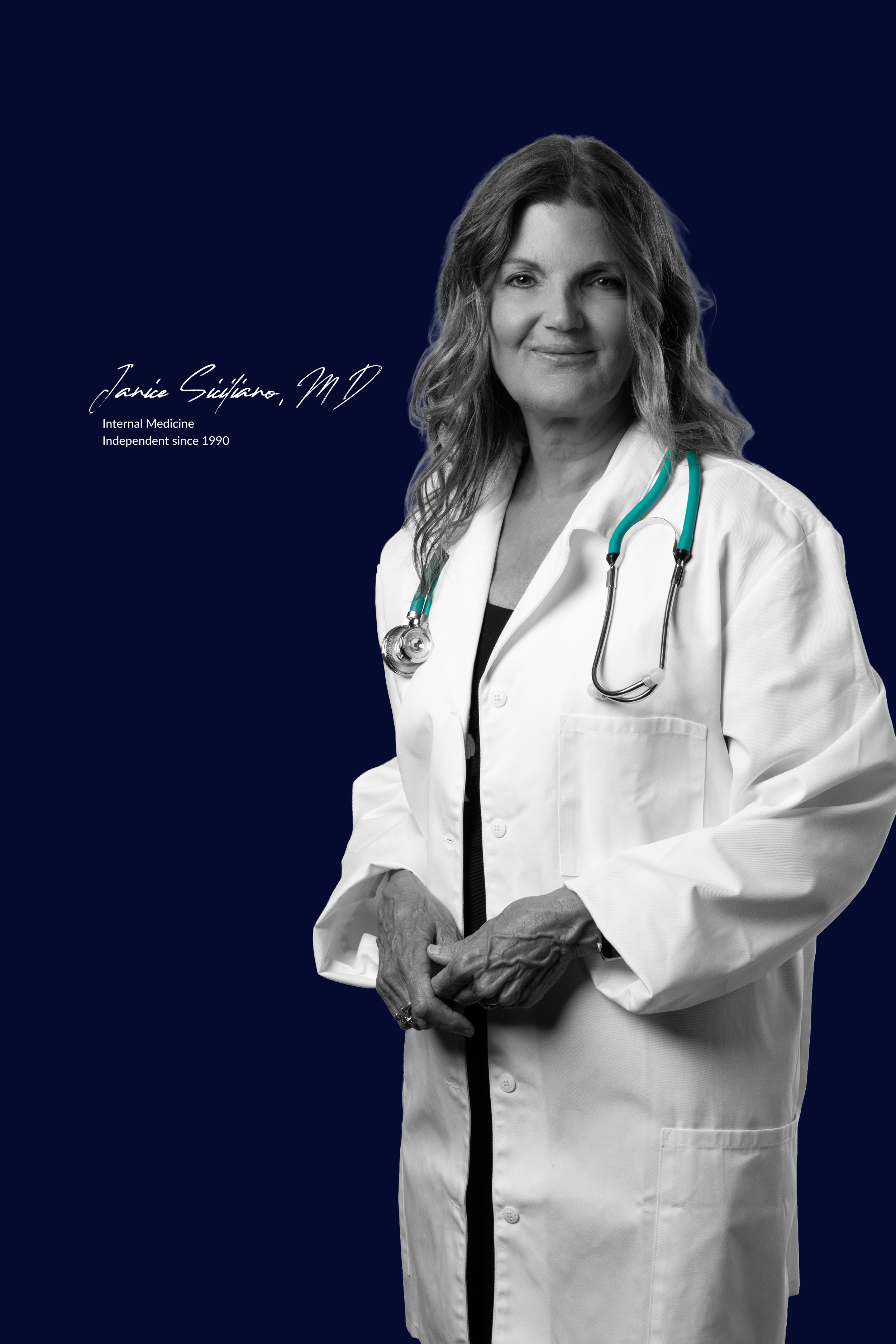
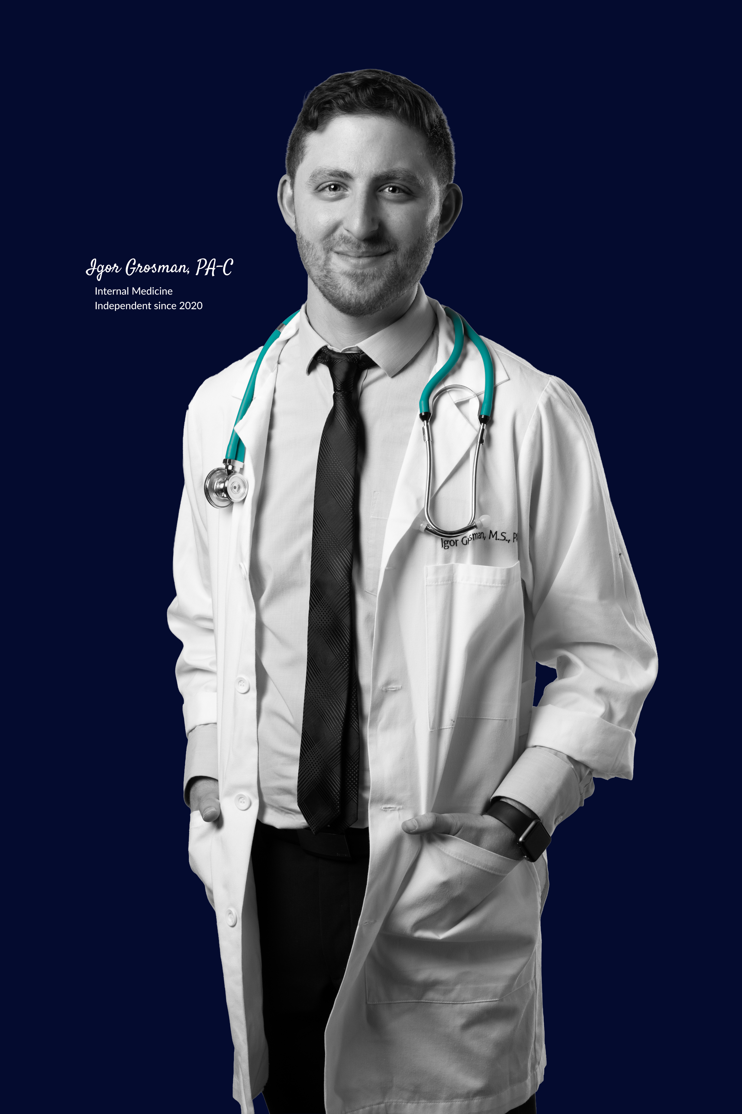
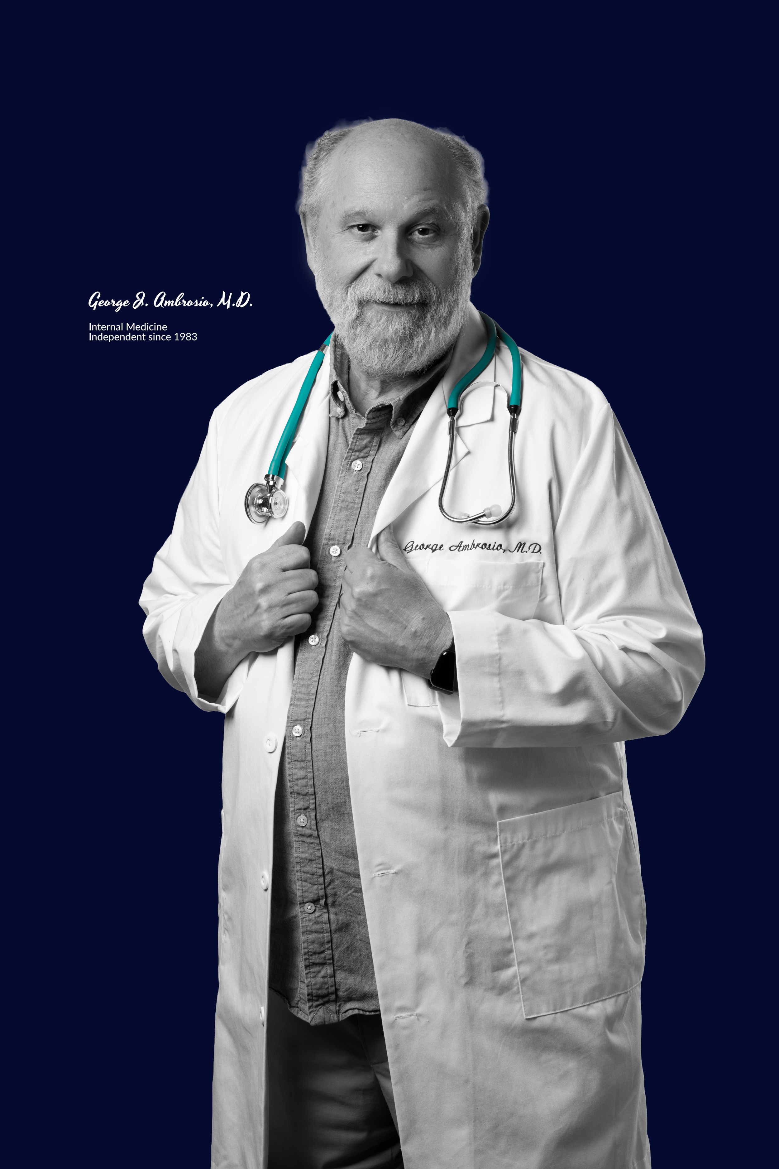
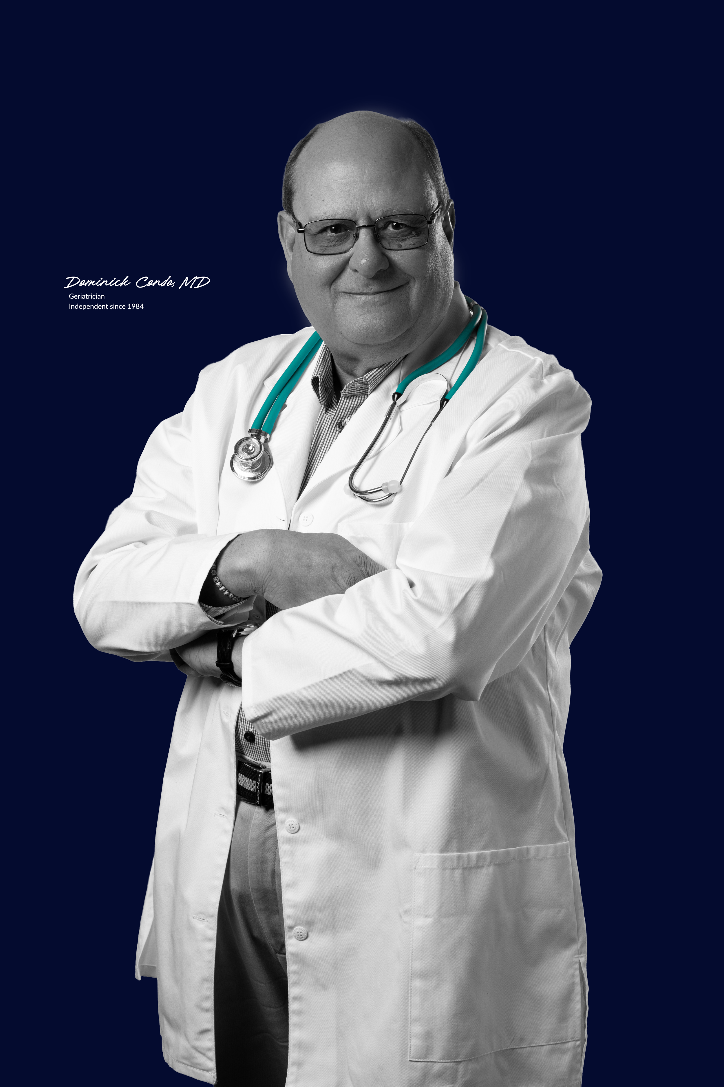
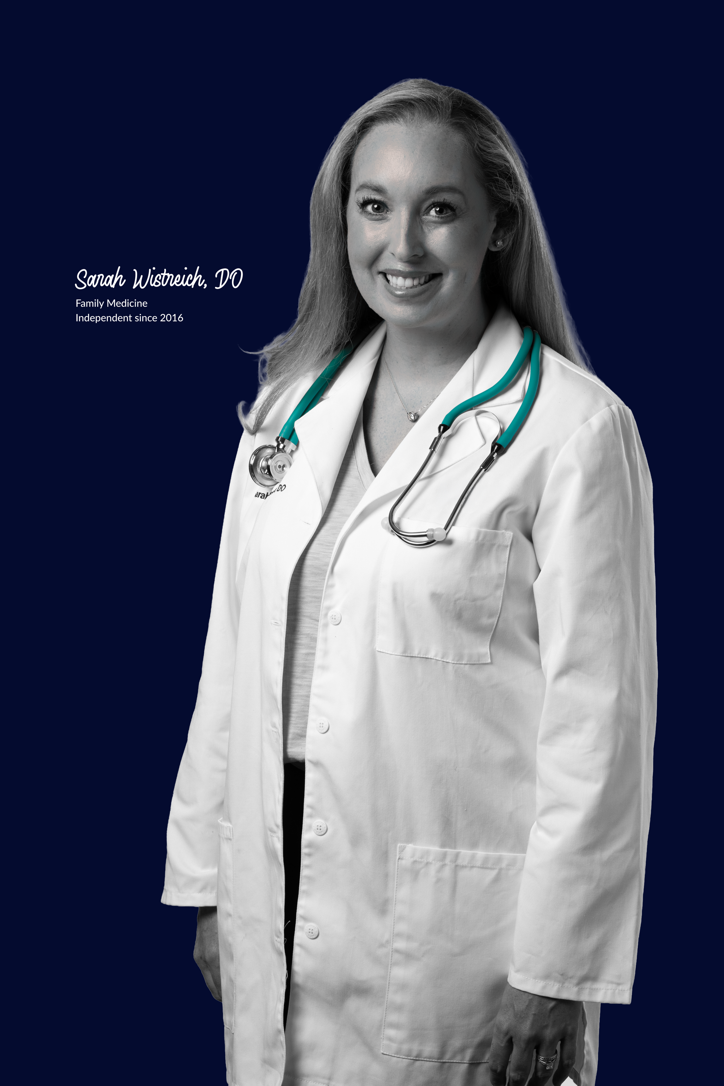
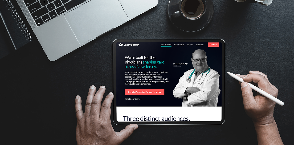
I helped develop and art direct a photography system that treated Vanova's practitioners less like healthcare stock-photo subjects and more like people being photographed for a respected editorial publication.
For the website, we photographed 22 actual Vanova practitioners, creating a proprietary image library that made the people behind the network the visual proof of the brand. Across web, print and social, each portrait was paired with the physician’s signature and years in medicine—adding another layer of individuality, credibility and experience to every image.
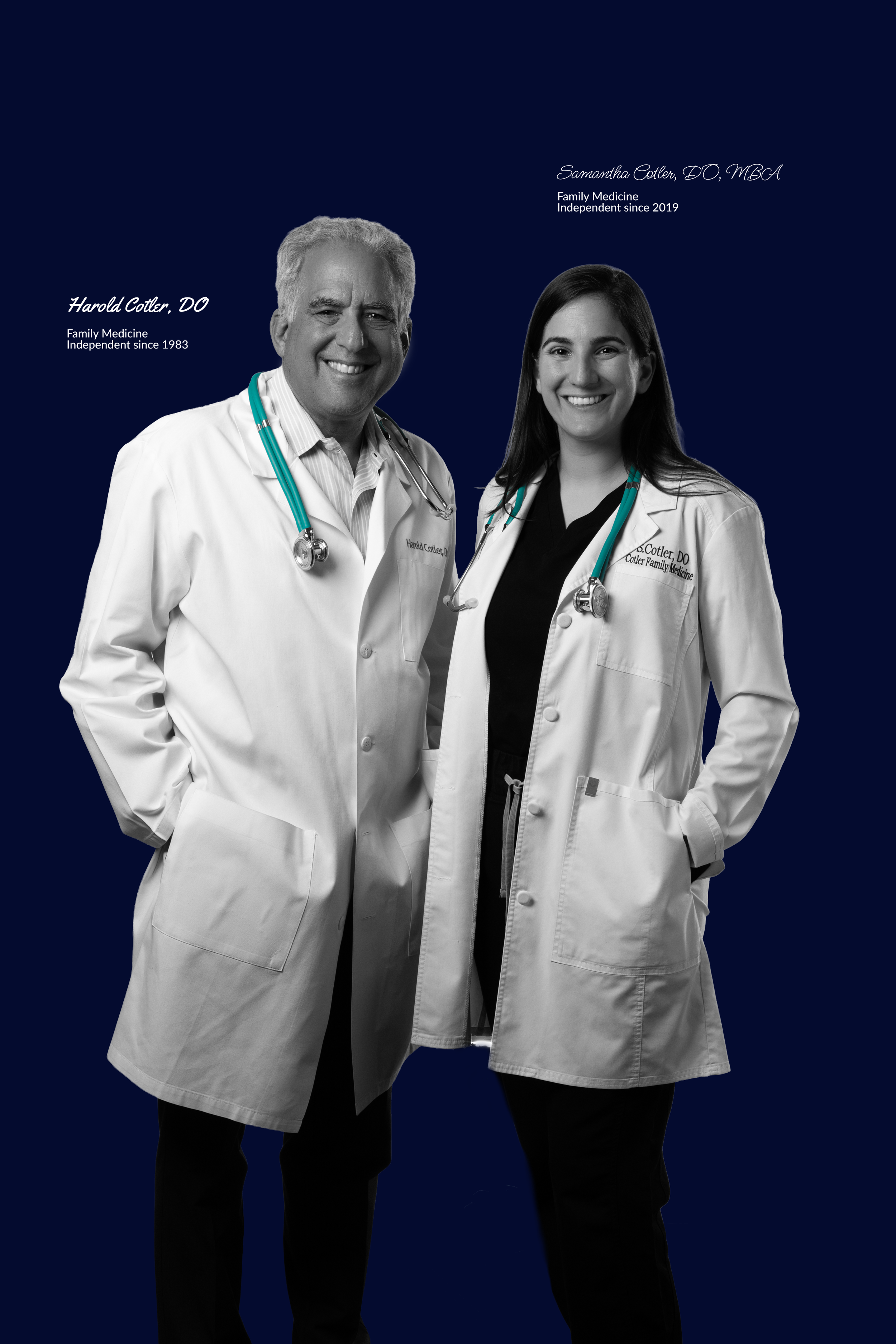
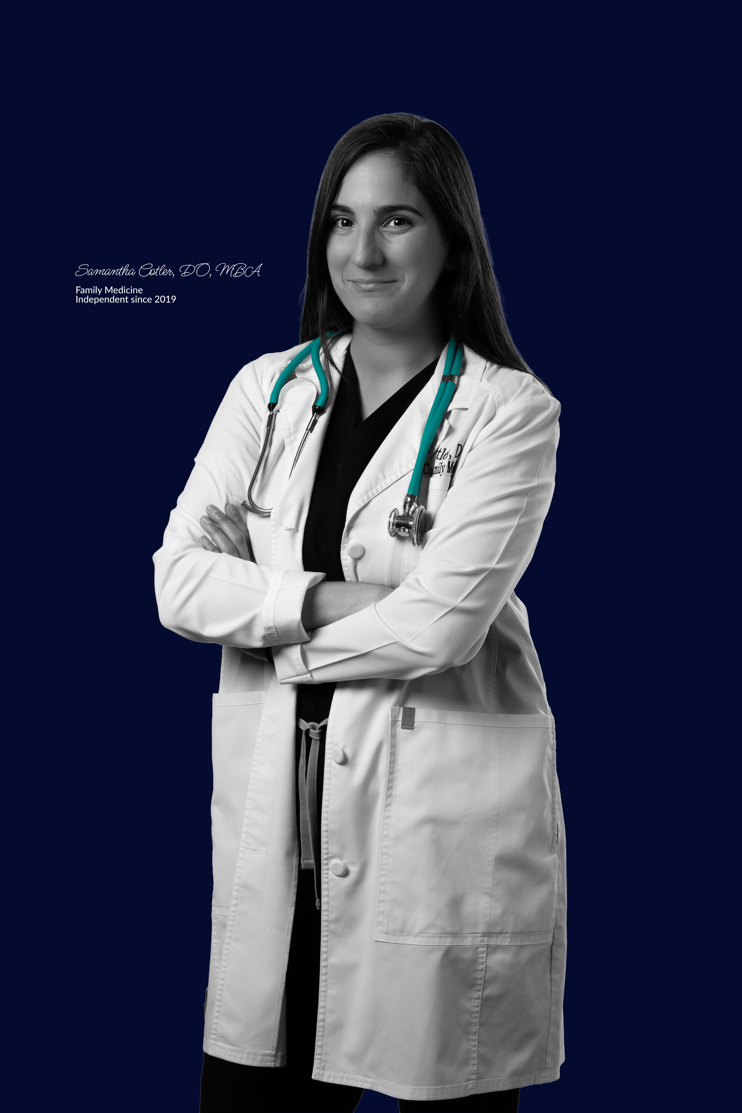
Build a system that works everywhere.
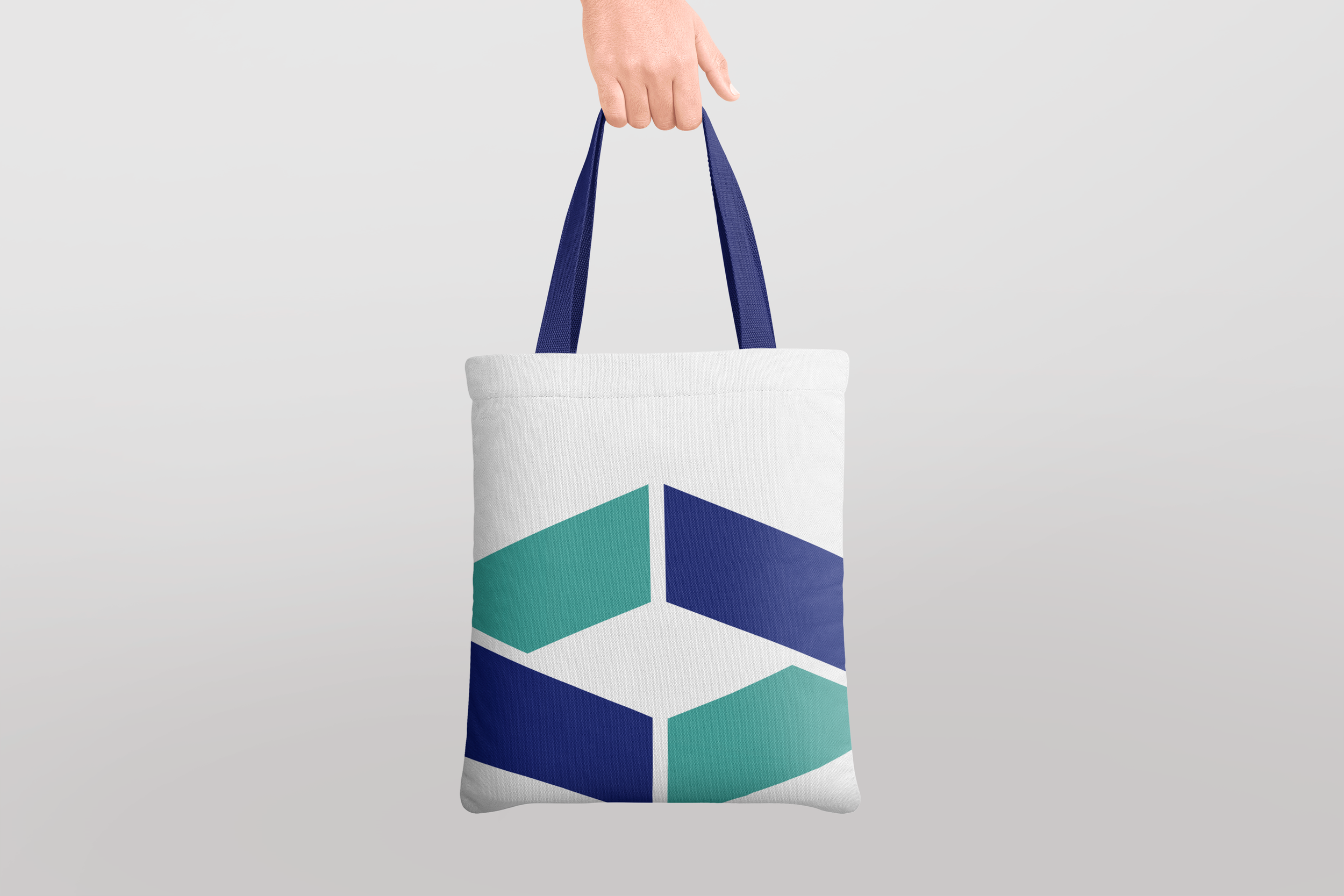
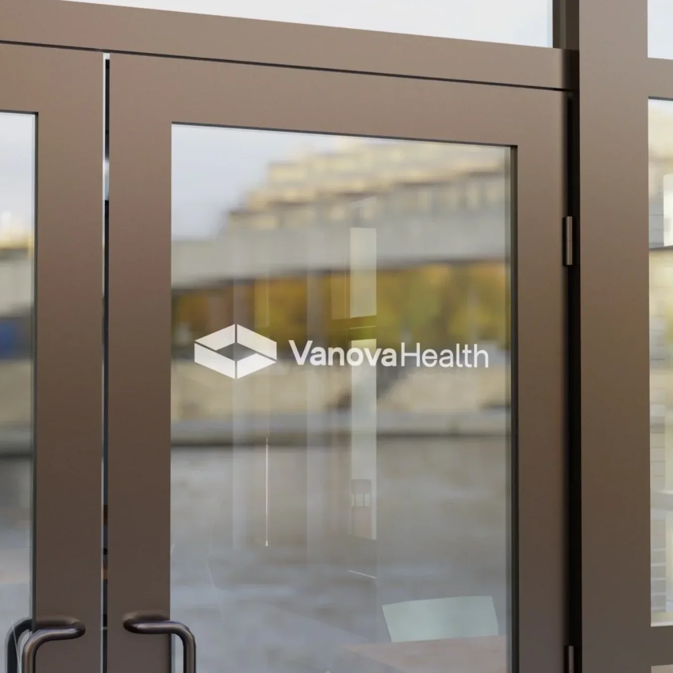
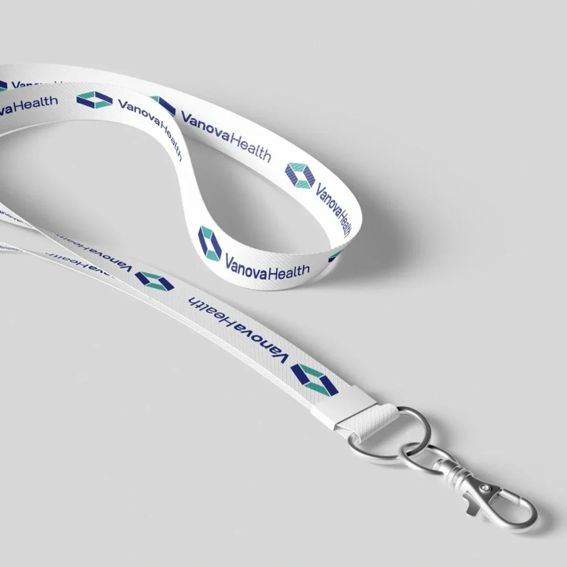
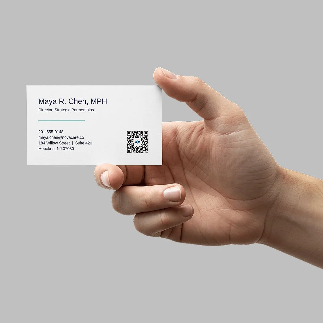
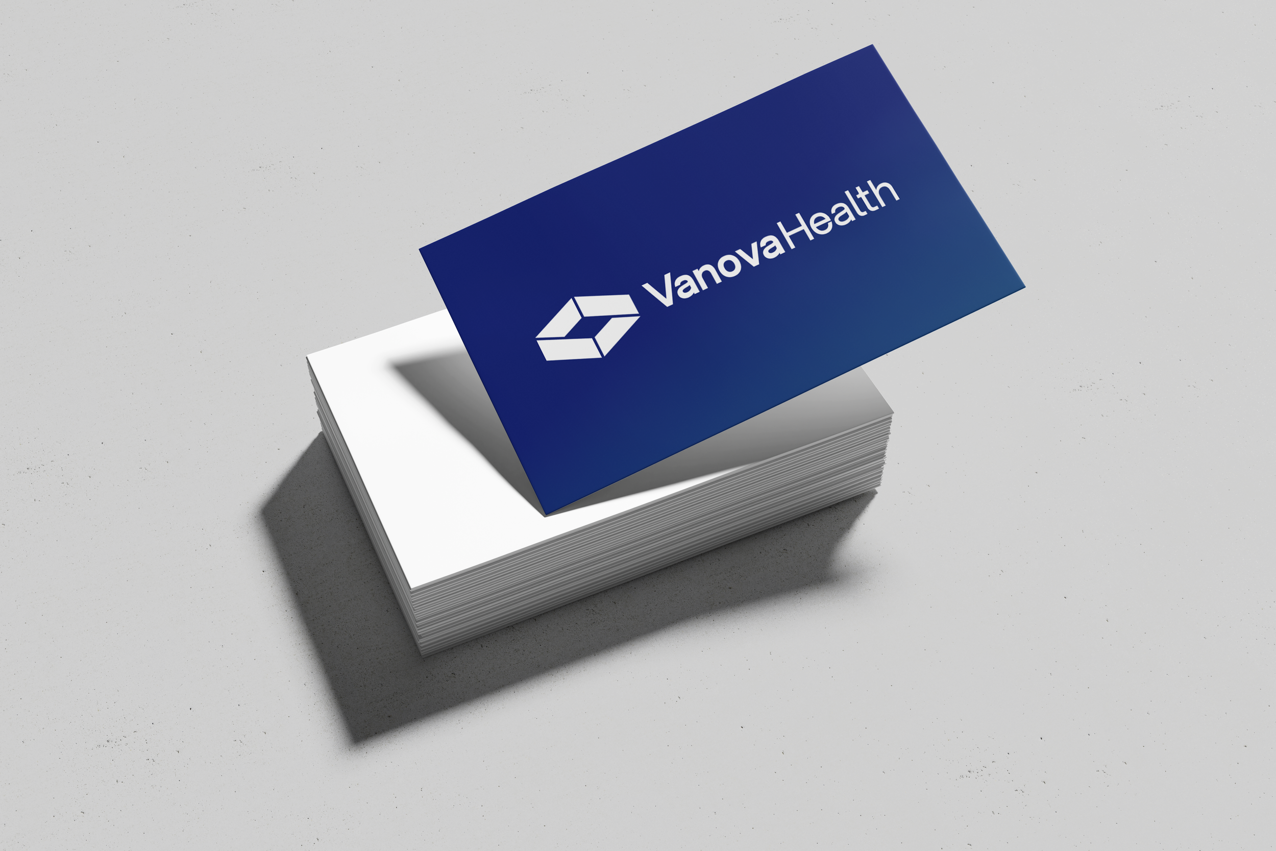
The new identity wasn't designed for one website or one campaign. We created a flexible system capable of carrying the same point of view across physician communications, recruiting, events, social, print and environmental applications.
Make the strategy visible.
The strongest brand systems don't just look cohesive. They make the positioning easier to understand.
For Vanova, every choice—from typography and color to photography and digital experience—was designed to reinforce the same idea: physicians shouldn't have to sacrifice their independence to build a stronger practice.
The result was a visual system the client adopted and continued extending across the organization.